1. Ki Suk Han was pushed onto the tracks by a man who was harassing people after an attempt to calm him down.
2. R. Umar Abbasi tried to warn the train by snapping his camera in hopes that the driver would see the flash and stop, but it was unfortunately too late.
3. It was pretty much taken in an act of panic, not for the photo itself, but to warn the train. He clearly didn't intend to take the photo.
4. He was simply trying to warn the train, but took a devastating photo in the process. On second thought, after reading the comments, I realized that he could of easily picked up the man from the tracks.
5. I disagree with the decision. Maybe if it was on the inside of the magazine, it would attract less bad attention because posting it on the front could possibly distress innocent people looking at magazine covers.
6. The difference between this photo and other infamous photos such as Kevin Carter's The vulture and the little girl and Frank Fournier's The Agony of Omayra Sánchez is that those photos were taken as aftermath. Abbasi could have easily saved the man from certain death.
7. Art is a complicated thing. Sometimes, you have to take a photo just to show how messed up the world can be. But costing a life is a whole different story.
8. Again, Abbasi could have easily saved the man if he hadn't stopped to take the photo.
9. Even though photography and art are two of my favorite things in the world, costing someone's life for the take of a photo doesn't seem worth it. I would have tried to pick the poor old man up from the tracks. Besides, the surveillance cameras probably captured the whole thing anyway, so what's the point of taking a picture?
Thursday, December 15, 2016
Wednesday, December 14, 2016
5 Websites
1. http://petapixel.com/2014/12/31/10-photography-resolutions-new-year
 |
| 1. I chose this photo because of the beautiful backdrop and personality. 2. I see that they used the background to fantastic effect. 3. It doesn't say who took the photo. |
2. http://petapixel.com/2014/08/25/approaching-problem-style/
 |
| 1. I chose this photo because of the black-and-white colors. 2. The rule of thirds was used. 3. Photographed |
3. http://www.rachelsussman.com/oltw/
 |
| 1. I chose this photo because the ocean always attracts my attention. 2. Cropping was used. 3. Photographed by Rachel Sussman. |
4. http://petapixel.com/2014/12/19/disorienting-beauty-spiral-staircases-old-abandoned-buildings/
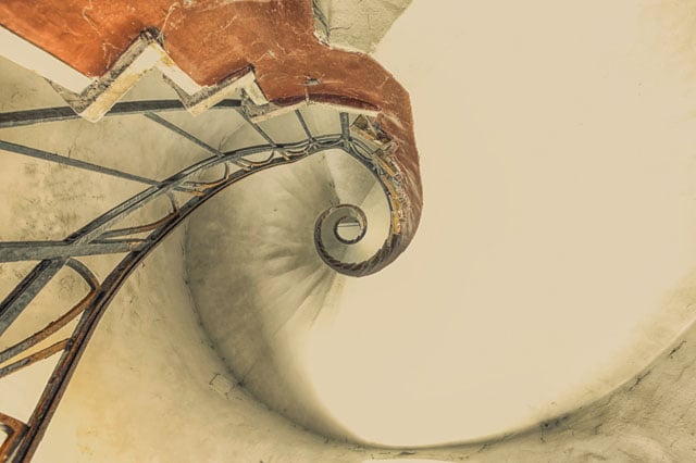 |
| 1. This photo caught my attention because of how disorienting it is. 2. Viewpoint was used to great degree. 3. Photographed by Christian Ritcher. |
5. http://blog.phowd.com/2014/09/7-tips-shooting-great-portrait-photographs/
 |
| 1. I chose this photo because of the expression. 2. Balancing elements was definitely used. 3. Photographed by Rajib Mukherjee. |
Tuesday, December 13, 2016
Magazines Pt. II
An image-based cover is the most common type of magazine cover. Most of the time, it's a portrait. Image-based covers are useful for, well, pictures. Illustration-based covers were most common before the 1930's, back when photography was barely a thing. However, illustration-based covers are still useful today, especially if you want to add a bunch of color and absurdity to your cover which couldn't otherwise be obtained with a typical photograph. Type-based magazine covers mainly consist of text. They're mainly used for more serious occasions involving stories. Concept-magazine covers tend to be the most artsy, as they usually have a certain meaning behind them. Finally, the relationship between words and photos on magazine covers is that the words explain what is happening in the picture.
My Favorite Cover

"When shooting Solange Knowles for The FADER, we wanted to reference her timeless songwriting, and emphasize her classic presence in the image. This cover was shot with an Bx 10 View Camera for a simple, timeless vibe, bringing only SO plates of film to capture the perfect shot (compared to a standard 2,000-shot digital sitting). We took many conservative, close up shots of Solange, but still wanted that final, bold image. We chose yellow as the backdrop, because it paired well with the natural lighting from the windows and the contrast of colors in her outfit. Solange stepped onto the apple box herself, and the shot we chose was the very last plate of film."
My favorite part about this photo is how well it fits with Solange's style. She's always had a very independent and closed-off personality, and the image of her staring off into space perfectly cements that. The way she calmly and silently sits with her legs crossed on top of a box of apples shows that she's thinking some deep thoughts at the moment. But enough with backstory, let me critique the actual quality of the photo itself. First things first, the lighting is on-point. It perfectly shines off her legs and leather skirt. The yellow background fits well with the white/blue shirt, and I also love the way her hair is just all over the place, making it basically the center of the photo. Overall, it's a fantastic shot. The FADER definitely has a very good taste in cover photographs.
Best Covers
1. Formal
2. Formal
3. Informal
4. Environmental/Informal
5. Informal
6. Formal
7. Formal
8. Formal
9. Formal
10. Formal
11. Formal
12. Formal
13. Formal
14. Environmental
15. Formal
16. Environmental
17. Formal
2. Formal
3. Informal
4. Environmental/Informal
5. Informal
6. Formal
7. Formal
8. Formal
9. Formal
10. Formal
11. Formal
12. Formal
13. Formal
14. Environmental
15. Formal
16. Environmental
17. Formal


Subscribe to:
Posts (Atom)